VIDEO: Vigil for Iraq: Original music and poetry honoring the dead, the wounded, the grieving,…
The Poetics of Beer Packaging: Colored Horse Studios and the North Coast Brewing Company

Take one poet trained in typography and history of the book, add amazing beer and some great illustrators, and you would have a distinctive lineup of beer packaging that sets you apart as a craft brewery, which is exactly what North Coast Brewing achieved when they hired graphic designer and poet Theresa Whitehill in 1999 to begin reevaluating their beer packaging.
Whitehill pointed out that while they had terrific illustration for their flagship brews Red Seal Ale (artist Mike Patrick), Scrimshaw (artist J.D. Mayhew), Old No. 38 Stout (artist Mike Patrick), and Blue Star (graphic designer Scott Peterson), the illustration wasn’t being as well utilized as it could be. She proposed a redesign, and the results have grown into a ten-year relationship between the graphic studio and the brewery.
Colored Horse Studios went on to design packaging for new beers developed by Brewmaster Mark Ruedrich, including Brother Thelonious (artist Eduardo Smissen), Old Stock Ale and Le Merle (artist for both of these being Whitehill’s husband and partner, Paulo Ferreira), Cru d’Or and Old Plowshare (organic brews), Black Hart Stout (an exclusive for Trader Joe’s), and their Twentieth Anniversary Ale.
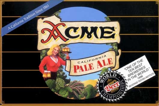
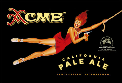
Over the years, North Coast Brewing Company’s patronage of north coast artists on their beer packaging emphasizes a focus on local creative talent. When it came time to redesign the venerable Acme label in 2002, the network of local artists led Whitehill to San Francisco Bay Area illustrator Eric Grbich for an impeccable retro style in keeping with vintage advertising art from Acme Ale’s rich history.
What’s fun about working for North Coast Brewing, according to Whitehill, is how many different products and media she gets to consider in her work, from grand format truck art to tap handles, six-pack carriers, 6 liter bottle neck labels, metal signs, embroidered leather jackets, coasters, enamel pins, and neon. While she’s waiting for the commission to design a baseball uniform or propose some movie titling (two of her dream projects), she’s kept plenty busy on the north coast. In addition to providing artwork for new beer brands, partner Paulo Ferreira’s illustration and sculpting skills are often called on to extrapolate older artwork for new mediums, and to develop the 3D models from which the brewing company’s tap handles are made.


For links to the brewing company’s mostly local North Coast creative talent, visit their links page: http://www.northcoastbrewing.com/links.htm
To see more of the graphic design of Colored Horse Studios, visit our website at www.coloredhorse.com